
Category: Academic Practice
11 Infographics and Videos for Teaching Economics
Sent to you by David Andrew via Google Reader:
via Free Technology for Teachers by noreply@blogger.com (Mr. Byrne) on 11/30/11
One of the current trends in the blog-o-sphere is the use of infographics for sharing general information about a topic (infographics also seem to be an SEO tactic). Over the last couple of years I've come across more than twenty infographics dealing with topics in economics. Today, I've assembled a list of some of the better infographics and videos for teaching topics in economics.
Mint, the free money management service, regularly posts interesting infographics on its blog Mint Life. One of the better infographics they've featured is What Is a Stock? What Is a Stock? uses clear graphics and plain terms to explain what a stock is, offer a brief history of stock markets, and give a brief explanation of why people buy stocks.

Personal Finance Software - Mint.com
(click here to view in full size)
Curious About George: What is the Lifespan of the Dollar Bill? is an interesting an informative infographic from CreditLoan.com. The infographic offers provides flow charts of the production, distribution, and eventual removal from circulation of currency. Some statistics about the quantity of dollar bills produced every year is also included in the infographic.
Through the Cool Infographics blog I discovered a neat infographic about the ten most expensive cities to live in in 2010. The infographic has three parts; a map, a set of explanations of the costs associated with living in each city, and a comparison chart. The comparison chart at the bottom of the infographic does a nice job of putting cost comparisons into terms that students can relate to. Included in the comparison chart are the costs of fast food meals, the cost of a cup of coffee, and the labor hours required to earn an iPod Nano.
Your Wealth Puzzle offers a neat infographic that could be useful in a consumer education course. The infographic uses a board game format to demonstrate the steps a person needs to take in order to build and maintain a good credit rating.

Credit Report Information Graphic
Visual Economics designs infographics to educate people about various topics in economics. One of their infographics that I like is How Do Americans Save Money? The infographic explains the differences between saving and savings and what disposable income is. The infographic also defines consumer confidence the sentiment index.
The New York Times offers an interactive infographic designed to help people determine when it makes financial sense to buy a home rather than rent a home. Users of the interactive infographic can enter variable data such as home price, interest rates, rent prices, rental rate increases, and housing market changes to determine when it's best to buy a home rather than rent. Users can also account for information like insurance rates, condo fees, and opportunity costs.
On Man vs. Debt I found the Student Loan Scheme infographic about student loans. Produced by CollegeScholarships.org the infographic features a flowchart that explains how student loans can burden people for years. As someone who, after ten years, relatively recently paid off his relatively modest student loans, I can tell you that I am happy my student loans were not any bigger. This infographic presents some good information for students and parents to consider before signing-on for tens of thousands of dollars in debt.
Through Michael Smith's Principals Page blog I discovered The Cost of Dropping Out produced by Teacher Certification Map and MAT@USC | Master's of Arts in Teaching. The infographic shows the costs to individuals and to the community of dropping out of high school. I've dropped the infographic into Zoom.it to make it fit below.
Follow the Money is a video that summarizes the data collected on Where's George? Where's George? is a website that was established for the purpose of tracking the travels of one dollar bills. Watch the video below.
China Widens Its Reach is an interactive infographic produced by Forbes. The purpose of the infographic is to allow visitors to view the investments China has made in other countries. Click on any transaction in the infographic to view the details of each investment. (The image below is a screen capture of the infographic, clicking it will take you to the real infographic on Forbes.com)
The Food Price Rollercoaster is an infographic produced by the World Food Programme to illustrate fluctuations in food prices over the last three and one-half years. The infographic highlights some major world events that happened at the same time as some large food price fluctuations. The infographic also illustrates the disparity between what families in rich countries spend on food and what those in poorer countries spend on food. You can view the infographic here or below.
This post originally appeared on Free Technology for Teachers. Follow on Google+, Facebook, or Twitter. 
Things you can do from here:
- Subscribe to Free Technology for Teachers using Google Reader
- Get started using Google Reader to easily keep up with all your favorite sites
5 Free Apps for Eye-Popping Graphics
Sent to you by David Andrew via Google Reader:
via OStatic blogs by Sam Dean on 07/09/11
 The worlds of open source and freeware both include many outstanding applications for working with graphics and photos. These include standard fare such as image editors, but it's also worth looking into more unusual graphics tools that you can work with for free. Whether you want to produce splashy graphical documents, enhance graphics on a blog or web site, create eye-catching logos, or more, check out this collection of five great, free graphics apps.
When it comes to open source graphics tools, GIMP gets a great deal of attention, and there are many free online resources available for it, but if you're in search of a free drawing and illustration tool that can compete with Adobe Illustrator and is increasingly useds by web designers for effects, logos and still graphics, give Inkscape a try. It runs on Windows, Mac OS X, and Linux, and is well-known as a powerful and flexible drawing and vector editing application. We covered it and resources for getting started with it in this post.
Dia is very similar to Microsoft's Visio application, and was developed as part of the GNOME project's office suite. There are many types of useful diagrams and flowcharts you can do in Dia. You can associate multiple diagrams with each other and work on them in tandem. Dia also exports diagrams in most popular graphics file formats. We covered the application previously in this post.
Gallery is an open source, web-based photo management and album organizer application available for Linux and Windows. Licensed under the GPL, Gallery makes it easy to blend photo management into a web site or blog. There is a Gallery Remote client available for it that lets you upload new sets of photos on-the-fly, and Gallery is available in over 20 languages.
Blender is one of the most popular free, open source 3D animation and graphics applications, for Windows, the Mac and Linux. You can learn how to create a great looking logo, how to execute special effects, and more. Blender has been used to produce striking full-length animated films and is worth getting to know if you haven't tried it. You can also download a great, free book on Blender, with step-by-step project instructions.
Aviary is a truly remarkable suite of free, online graphics applications, and it has won many awards. It isn't open source, but it is freeware, and has become much more than the dedicated image editor that it started out as. You'll find a vector editor, a color palette editor, a tool for creating visual effects, and more. All of the tools are available for you to use within your browser. Aviary also comes with many tutorials, similar to those found online for Photoshop.
Related Activities |
Related Software |
Related Blog Posts |
Things you can do from here:
- Subscribe to OStatic blogs using Google Reader
- Get started using Google Reader to easily keep up with all your favourite sites
Business and Economics: E-Learning and Blended Learning – Diagramly – Draw D…
Sent to you by David Andrew via Google Reader:
via David Andrew's followed topics | Scoop.it on 05/09/11
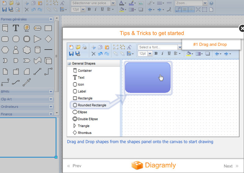
Diagramly is a free online diagram drawing application for workflow, BPM, org charts, UML, ER, network diagrams...
Source: www.diagramly.com, via 21st Century Tools for Teaching-People and Learners
Things you can do from here:
- Subscribe to David Andrew's followed topics | Scoop.it using Google Reader
- Get started using Google Reader to easily keep up with all your favourite sites
Top 10 Free Tools To Create Visually Appealing Infographics Easily | Design World Vision
Visual Thinking Archive – a set on Flickr
Visual Thinking Archive - a set on Flickr: "This group of visuals has been designed and produced by me (David Armano). You are welcome to use the visuals for presentations, slideshows and blogs posts. Please provide proper attribution and a link is always appreciated."
Find & Make Your Own Infographics With Visual.ly
Find & Make Your Own Infographics With Visual.ly: "


If you like clever data visualizations, you’ll love Visual.ly, a startup that lets you find and make infographics with all kinds of web-based data.
The site aims to be a repository for graphically organized information on the web, as well as a marketplace and community for publishers, designers, researchers and everyday web users.
Visual.ly contains three main components. First, it’s a search engine for web-based infographics. Second, it’s a silo of data from government agencies, non-profits and other research- and data-focused entities.
Third, Visual.ly is a web-based platform for creating infographics of your own — no graphic design experience or software required.
Already, the site boasts a collection of 2,000 infographics in its indexed and searchable galleries, as well as 60,000 users who signed up for beta access.
Here’s a demo of the site:
In a release, co-founder and CEO Stew Langille said, “We knew we were onto something big, having seen the power of data visualization work so dramatically across the Web.”
The service’s main infographic creation tool will launch in a few months.
Not only does the site aggregate and help you find great infographics, it also lets you make infographics of your own using various types of data. A demo of this capability can be seen right now with the Twitter Visualizer, a tool that lets you build and customize Twitter infographics.
Right now, you can use Visual.ly’s Twitter tool to generate infographics based on yours and others’ Twitter usage. For example, here’s a visualization showing my tweet data compared to data from Tal Siach, a Visual.ly co-founder:

Top image based on a photo from iStockphoto, spxChrome
More About: infographics, startup, visual.ly, visually
For more Dev & Design coverage:
- Follow Mashable Dev & Design on Twitter
- Become a Fan on Facebook
- Subscribe to the Dev & Design channel
- Download our free apps for Android, Mac, iPhone and iPad
"
Learning How To Visualize

Been getting a ton of requests for ‘how to’s and guides for creating decent visualizations and information designs. Made me think: maybe I could do some workshops in this area. I like developing ideas and working with people. Could be fun!
So if you think you’d like to attend a workshop on visualization or organize one for your organisation, please fill in this quick form (30 seconds).
some guides
In the meantime, you might be interested in a section I’ve been building in a far-flung corner of the site. It documents my process for creating infographics.
The most recent one explores the stages we went through creating an infographic for Wired magazine about planets in other solar systems – or “exoplanets”.
(Microscopic, dark and unimaginably far away, these tiny celestial objects should be impossible to spot. But thanks to extreme telescopy, deep data analysis, and ingenuous hacking, astronomers have now detecting over 500 bizarre and exotic alien worlds thousands of lights years away. So cool!)
some other examples
 Timelines: TimeTravel in TV and Film
Yup, we went through 36 drafts of this. Yes, I am a rampant perfectionist. Yes I can be difficult to work with.
 Information is Agonizing: Designing The Cover of the book
Creating the UK cover for Information Is Beautiful was an agonizing yet gloriously creative pain in the ass involving over 90 – yes nine-ty – different versions.
 Versioning: Because Every Design Is Good For Something
How do you flag and label 142 countries on a single map without choking the result? With great difficulty.
I hope this is helpful. And again if you think you’d like to attend a workshop to learn how to create these kind of images, please fill in this quick form (30 seconds).


"
7 Essential Books on Data Visualization & Computational Art | Brain Pickings
How the World Uses Social Networks [INFOGRAPHIC]
Sent to you by David Andrew via Google Reader:
via Mashable! by Sarah Kessler on 23/06/11

Social networks in every country might live on the same Internet, but that doesn't prevent differences in online customs and culture from developing along geographic borders.
Ongoing market research service Global Web Index has mapped these differences in the infographic above (click it to enlarge).
The research, run by London-based consultancy Trendstream, has conducted six waves of surveys about global consumer adoption of the Internet and social media in 36 markets. It used data from its February 2011 surveys of between 750 and 2,000 online users in each market to define three behavior types: messagers, groupers and content sharers.
In some countries, many of them Asian, most people were focused on content sharing. Others, like the UK and Canada, had more people who put a greater emphasis on sending messages.
Trendstream also used data from the survey to map social network penetration in each country that it surveyed.
Does the way any country uses social networks surprise you? Let us know in the comments.

More About: global web index, infographic, social media, social networks, trending, Trendstream
For more Social Media coverage:
- Follow Mashable Social Media on Twitter
- Become a Fan on Facebook
- Subscribe to the Social Media channel
- Download our free apps for Android, Mac, iPhone and iPad
Things you can do from here:
- Subscribe to Mashable! using Google Reader
- Get started using Google Reader to easily keep up with all your favourite sites